the project
Bundil App
Project overview
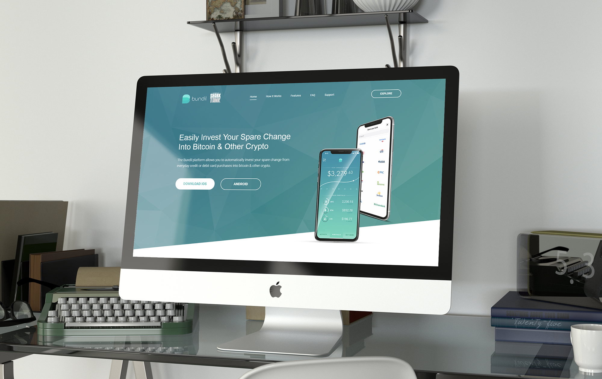
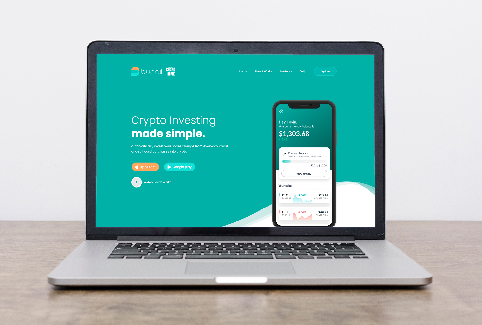
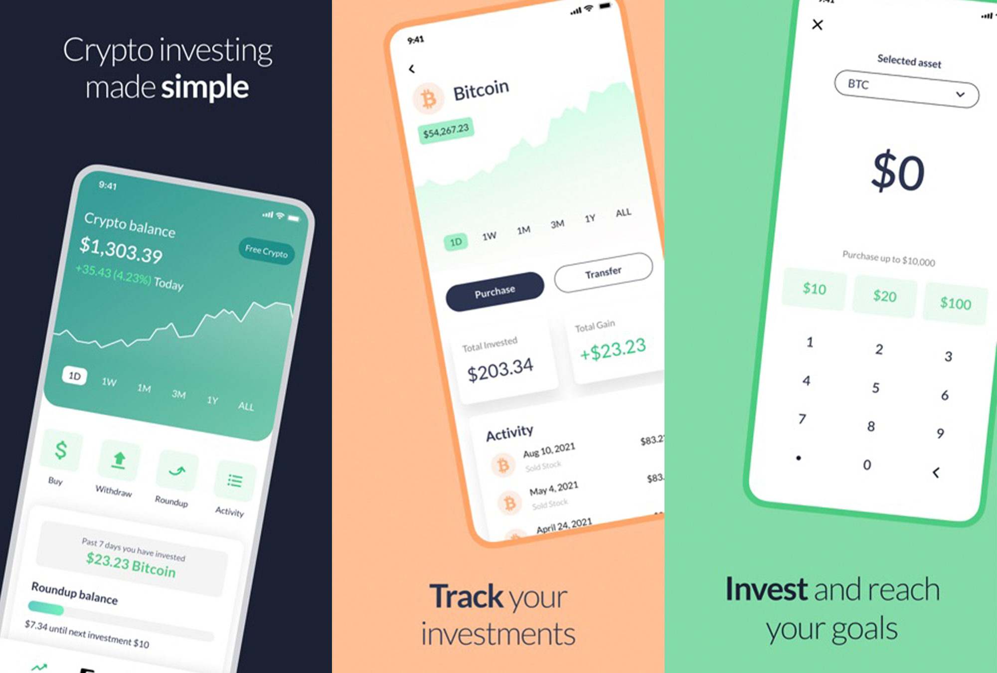
Bundil is a mobile app that allows users to automatically round up their spare change from everyday purchases and invest it into cryptocurrency.
The problem(s)
Crypto currency can be complicated and sometimes difficult for the average user to grasp. We also needed to collect quite a bit of information from the user during onboarding for the app to work properly and to comply with KYC (know your customer). The UI needed to ensure that users are able to quickly easily understand the round-up threshold, among other features of the app.
There were a few more problems with the over all functionality of the app, including finding the right partners for securely purchasing and storing crypto, overcoming KYC & AML issues, overcoming payment providers not being comfortable with crypto, or using their system for the purchase of crypto. One of the biggest hurdles was figuring out how to get around the marketing ban that the majors (FB, Google, Twitter) imposed a few weeks before our initial launch of the MVP.
The process
Research:
I started with researching the subject matter. I was not a crypto expert, but I needed a really good grasp of the concept and to learn current state of the technology as well as researching any competitors in the space.
Customer Journey:
Early on I created the overall customer journey and after talking to 20-30 potential users about their interest in crypto as well as their education and comfort levels with the technology, the initial user persona started to take shape.
More research:
After creating the journey we had to figure out how to facilitate the experience. This included researching tools and partners that would be needed to integrate with to facilitate the user flow.
Flows for each stage:
I created flow charts for each stage of the user journey. I took my time with this because having a detailed well thought out flow helps with a smooth design process. We hired a couple of developers at this point so I was able to collaborate with the developers about the tools/APIs that were identified and figure our the best flow for each portion of the experience for the MVP.
User stories:
I believe having detailed user stories allows you to complete wireframing/lo-fi designs much more efficiently.
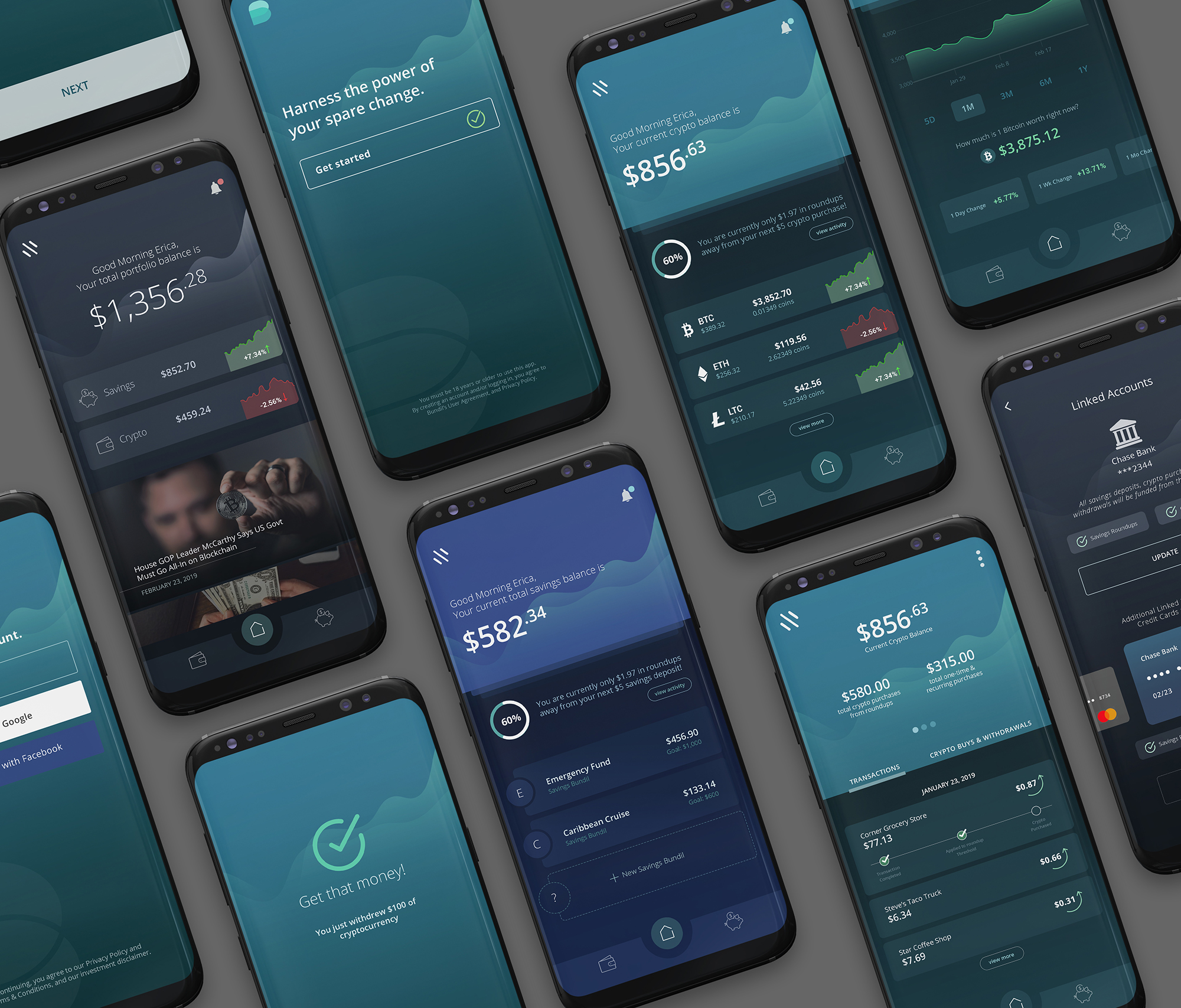
Wireframing/Lo-fi design/Hi-fi design:
I used the user stories to create the wireframes/lo-fi designs for the MVP. At this point I had hired a couple more designers to help. We then moved to creating the hi-fi designs.
Prototype:
We created a clickable prototype using the Hi-fi design and tested…a lot. We tested with crypto curious people through crypto fanatics and tweaked the designs using that user feedback.
Development/Iterations:
The developer handoff was pretty smooth, but we did have to make both UI and UX tweaks during the development process when getting more understanding of the tools that we were integrating with. We are now at version 3.5 of the app. We have rebuilt it twice on different liquidity/payment providers until we were able to find the right fit.
—
Being at the forefront of a technology as well as creating clarity out of something as ambiguous as cryptocurrency is challenging, but definitely a great experience. I have to also say that a portion of our initial persona was incorrect. The data showed that our user base skewed quite a bit older than our initial testing showed, and the persona has been revised and refined throughout the iterations.
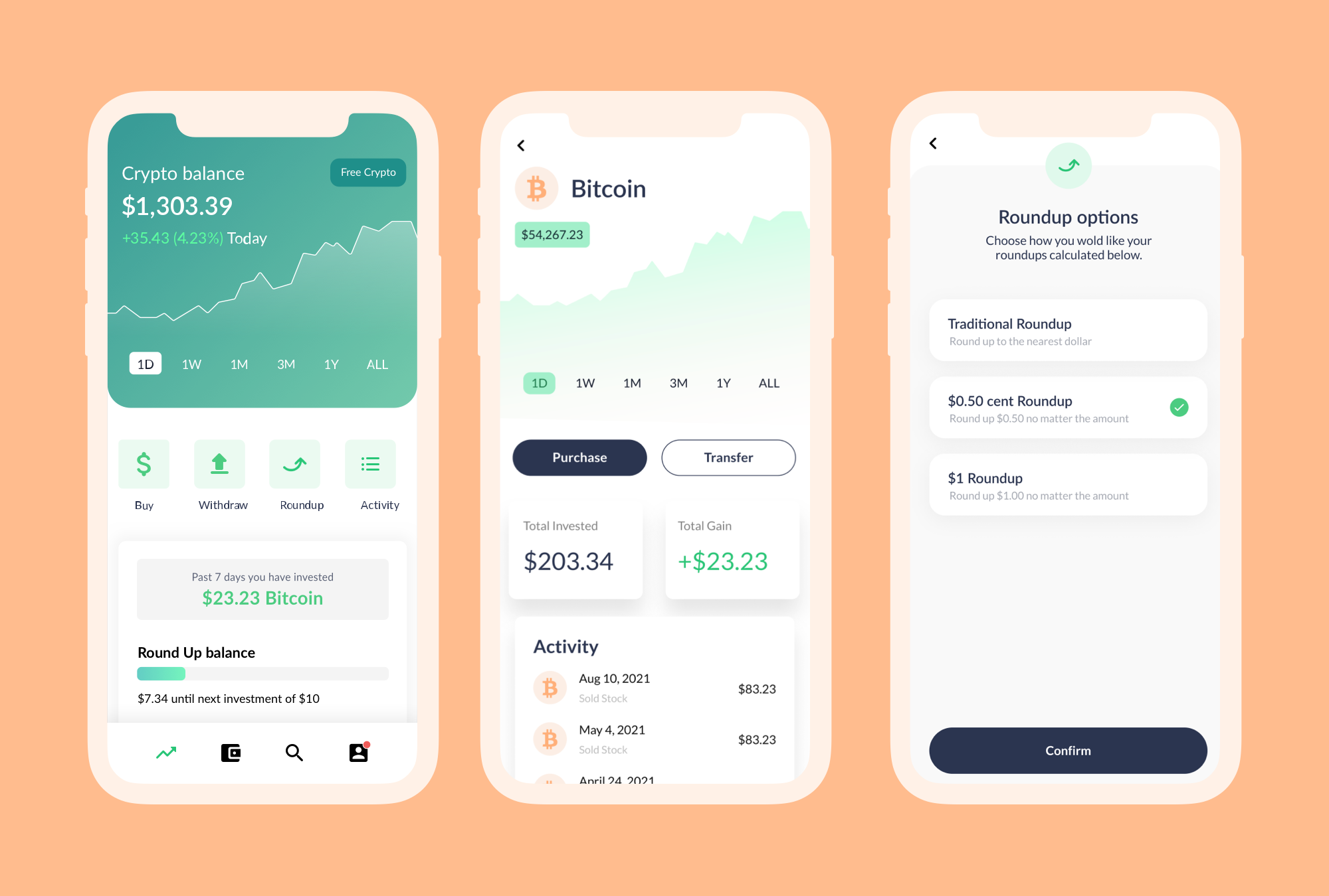
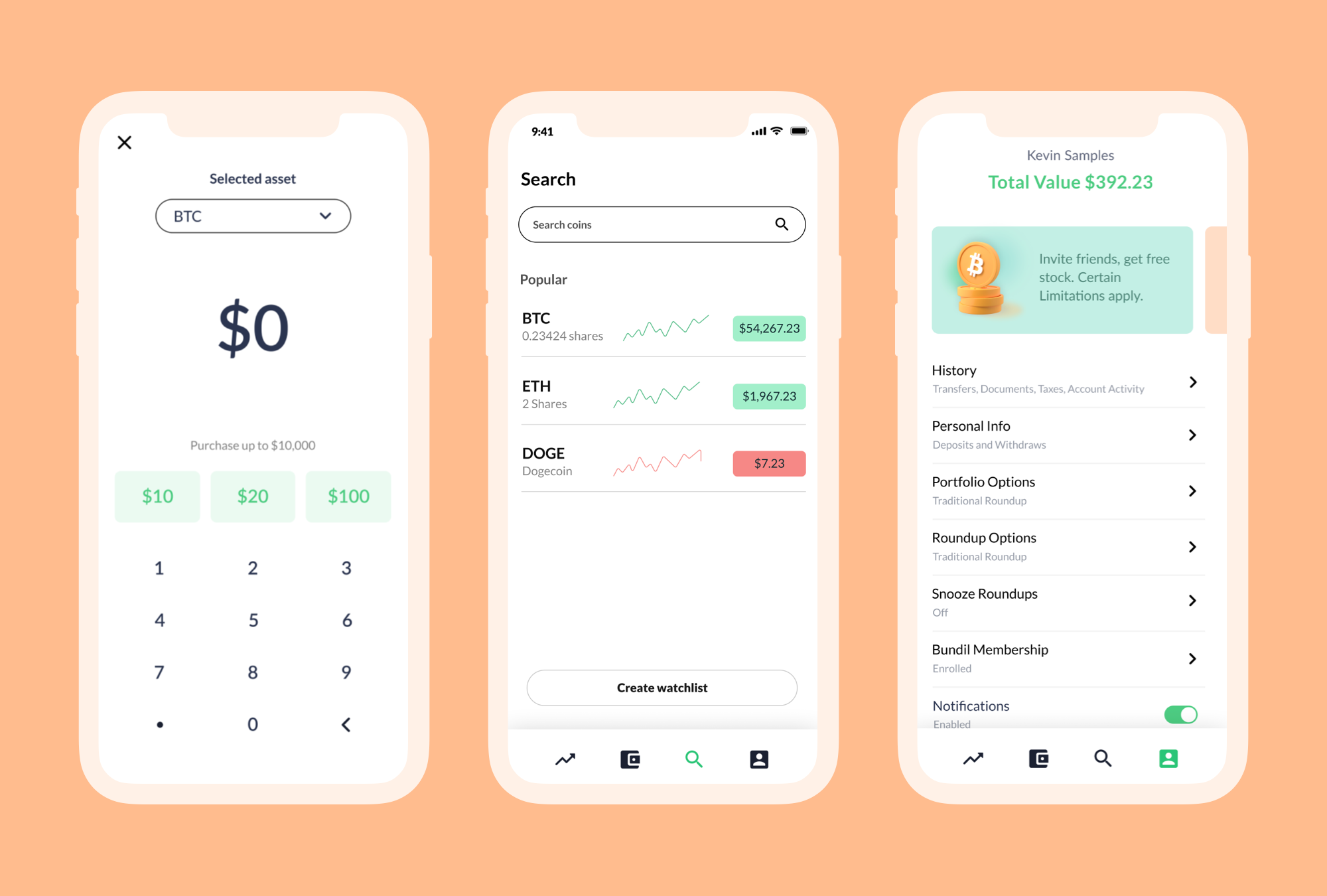
The solution(s)
On-boarding experience:
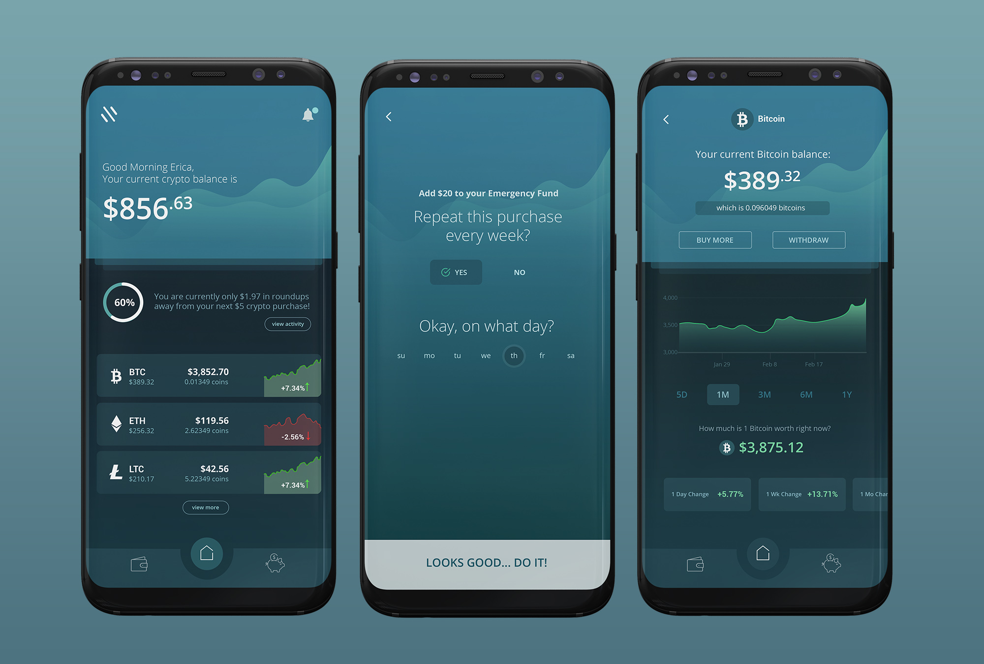
We created an onboarding flow that didn’t overwhelm the user and got them to the dashboard quickly. We asked one question at a time, gave the user a progress bar, and split the onboarding process into two sections. We only requested the information that was needed for the user to start purchasing crypto, and took the user through the KYC/AML flow only when they wanted to withdraw their funds. This allowed a relatively quick and satisfying onboarding experience for the user.
User Interface:
Using size and location hierarchy as well as color highlights, I was able to create an experience that allowed the user to scan quickly to understand the information provided and function of each screen.
Iterations:
For subsequent iterations we changed our color palette and brightened the UI, updated the logo, and used user feedback to create a better experience for the user.
Marketing Ban:
Getting featured on Shark Tank definitely helped with the marketing ban. We also implemented influencer marketing and found many other avenues other than the big 4 to market the app to our target audience.